UI DESIGN • APPLICATION AND RESPONSIVE WEBSITE
Fortuna
Creating the UI for a new responsive banking application. The client was a challenger brand looking to make waves in the financial world. They wanted an intuitive design that would work responsively across desktop, tablet, and mobile and for the design to be something that made them stand out from the crowd.
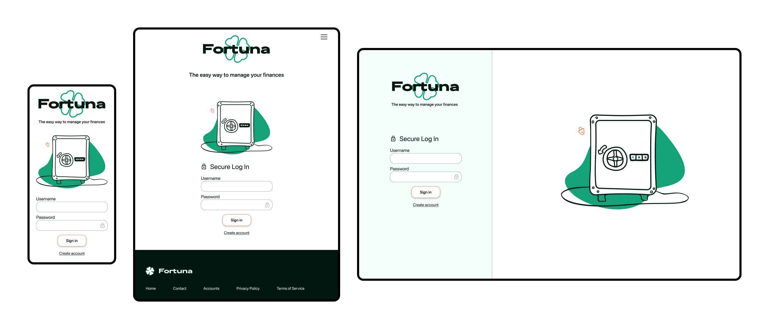
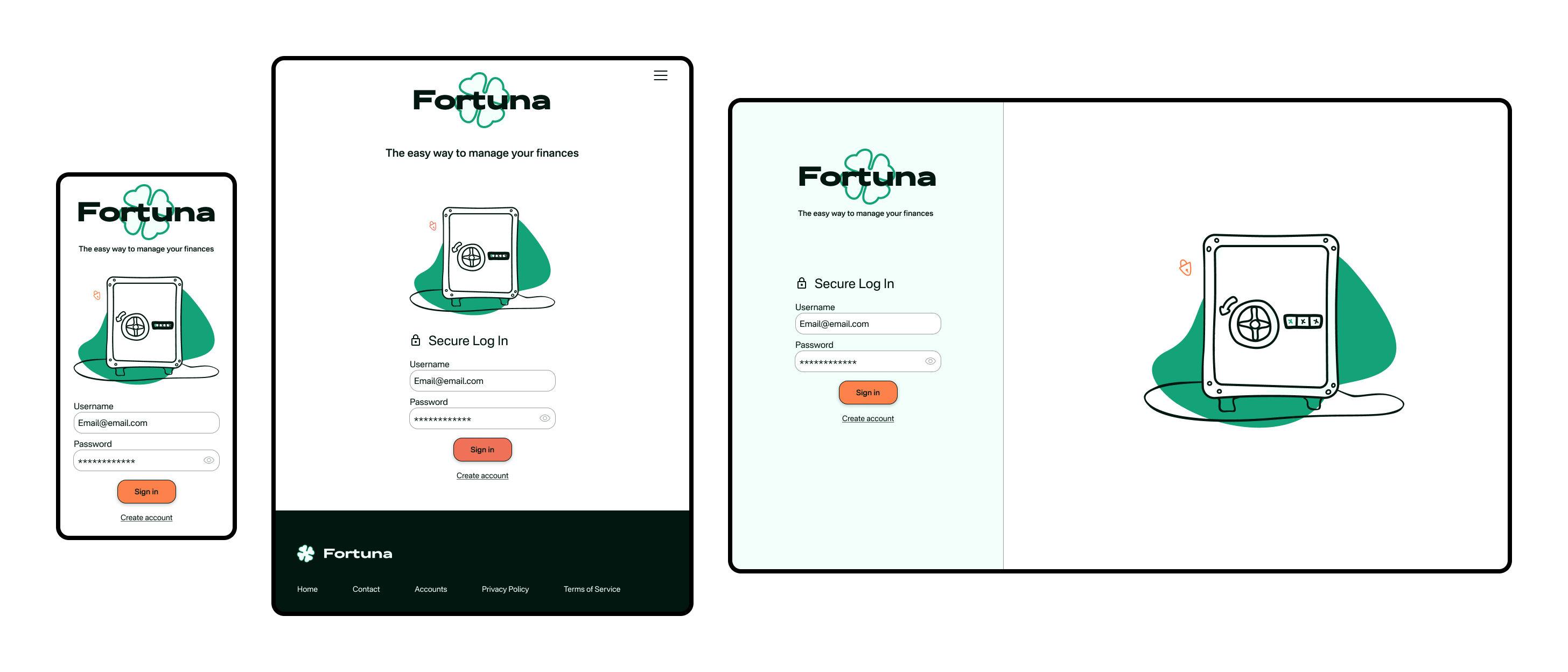
Platform: mobile app and responsive web design for desktop, tablet, and mobile
Role: sole product designer
Playful.
Clear.
Trustworthy.
These were the established brand principles regarding their tone and personality. Using the product should be a joy for users - not afraid to show personality through color, animation, and shape, but not at the cost of being intuitive. Since sensitive financial information is involved, it should be presented in a logical and uncluttered way. And users must feel they can trust the product.
The UI design for this challenger brand in the financial world balances the competing principles of being playful yet clear and trustworthy.
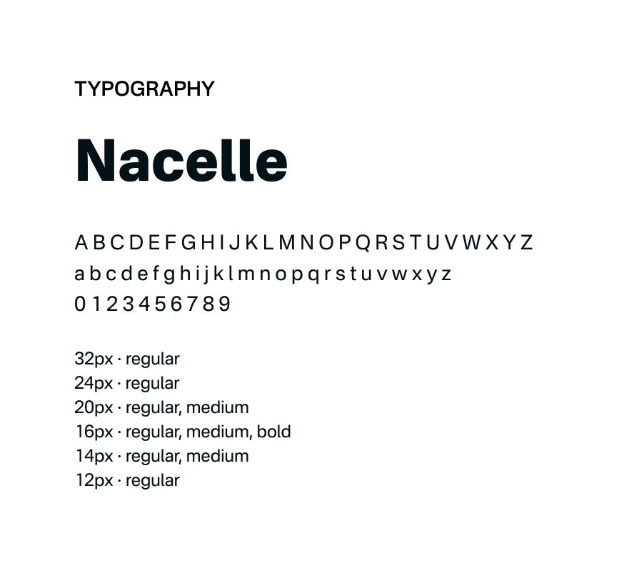
Typography
A single typeface is used while different weights, sizes and styles create a clear hierarchy of information. In addition, the single typeface reduces cognitive load, contributes to a consistent and trustworthy brand image, and enhances clarity and readability.
Nacelle is a sans-serif font, which is good for legibility on interfaces at a variety of sizes while still having some unique aspects that attract interest and stand out a bit from the usual typefaces.
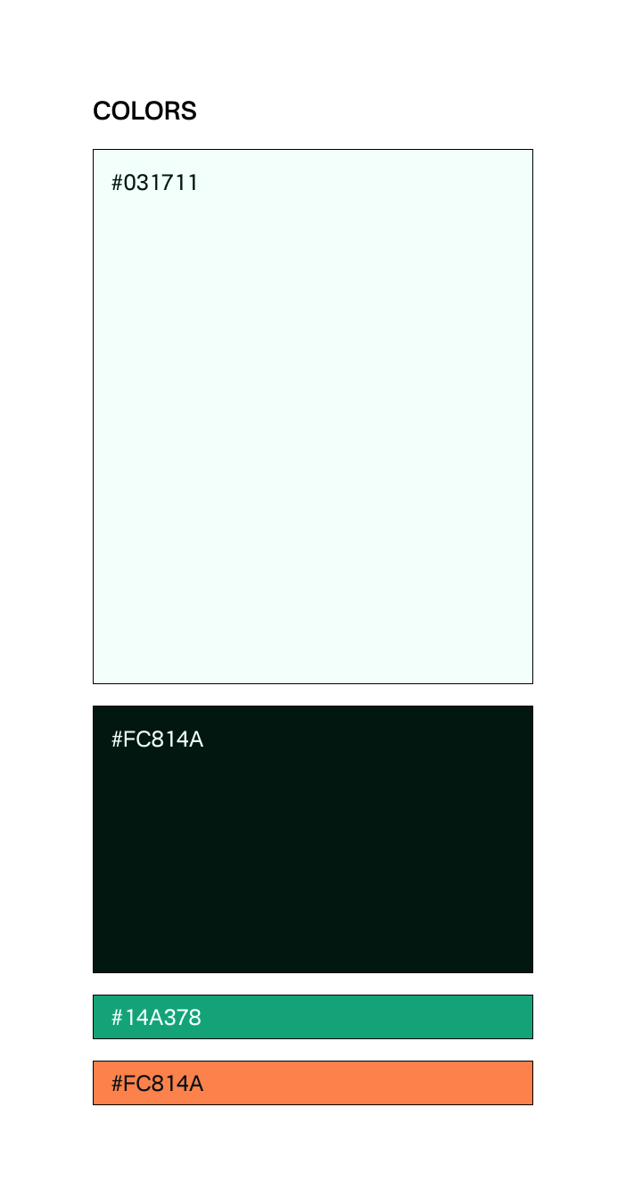
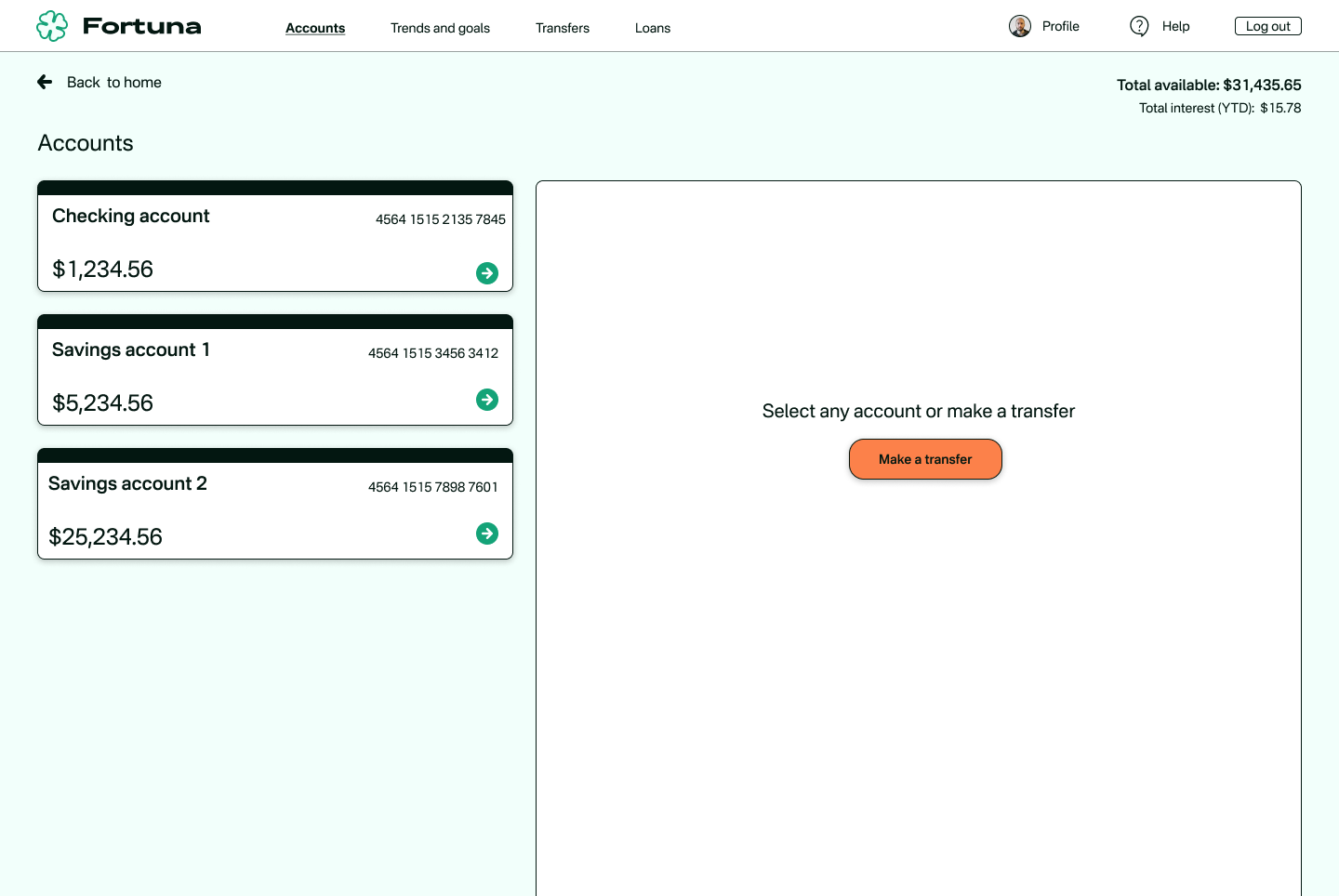
Colors
The bold and vibrant color palette showcases the brand's personality without compromising on usability. The color scheme is used consistently throughout the design to create a cohesive and memorable visual identity.
A shade of green is used which can evoke feelings of prosperity, abundance, harmony, and growth. This works well for a financial product where it is important for users to have a sense of well-being.
As an accent color, orange evokes a sense of energy, excitement, and confidence - perfect for an application that aims to help users feel excited about setting goals and planning for a brighter financial future.
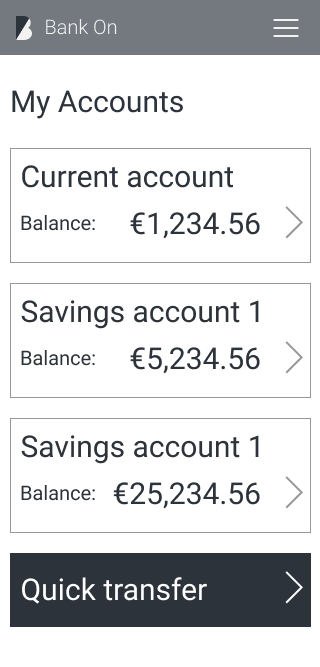
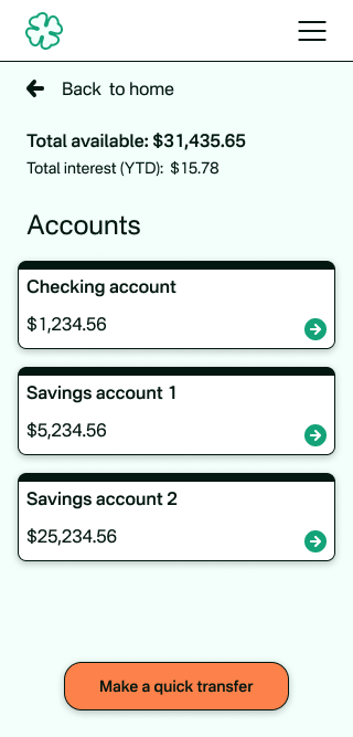
Move the sliders to see some quick wireframe|high-fidelity transitions.
Mobile:
Desktop:

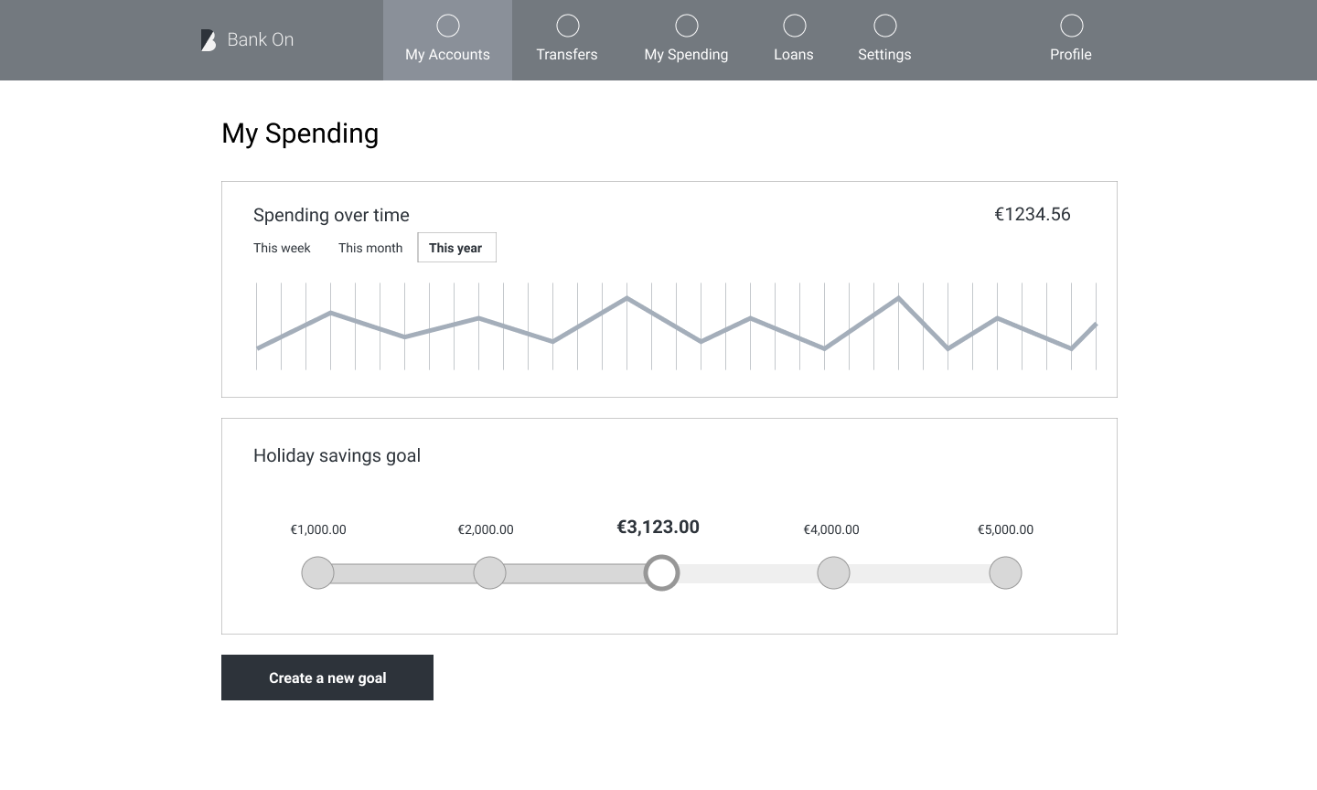
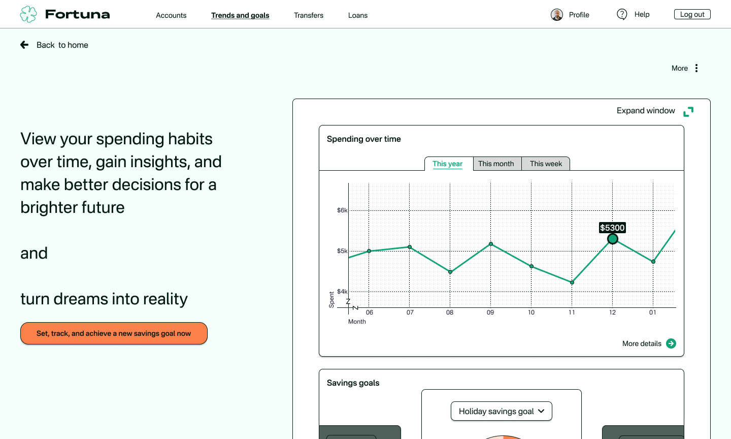
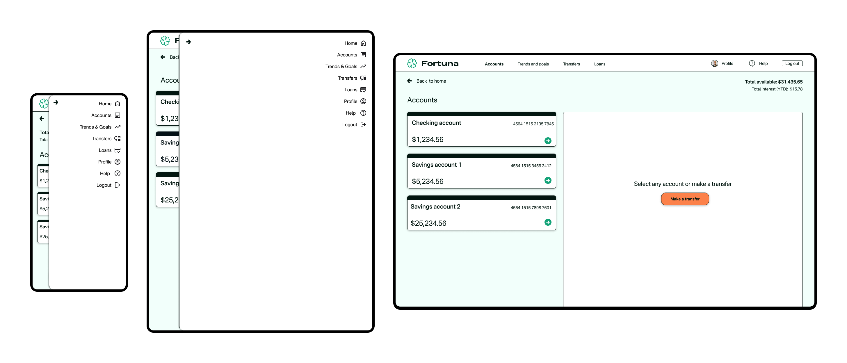
Playful
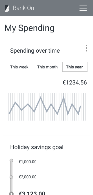
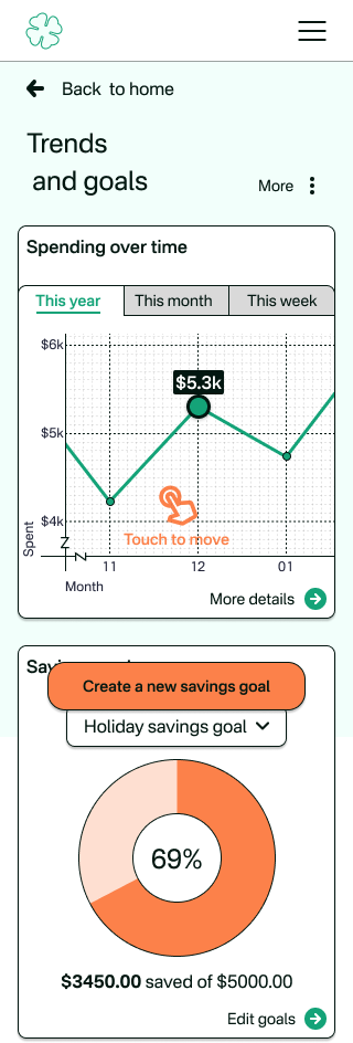
The app and website feature illustrations that add some fun and make the experience more engaging for users. The icons quickly convey information while still having a slightly casual feel to them. These elements are carefully integrated into the design to provide pleasant visual cues and enhance the user journey without compromising on usability..
Clear
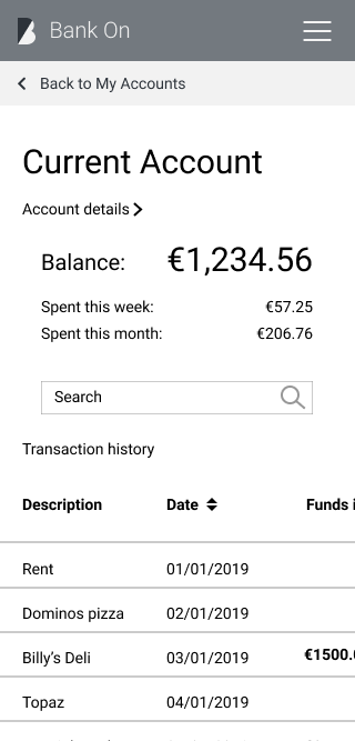
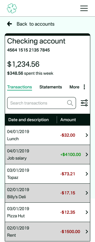
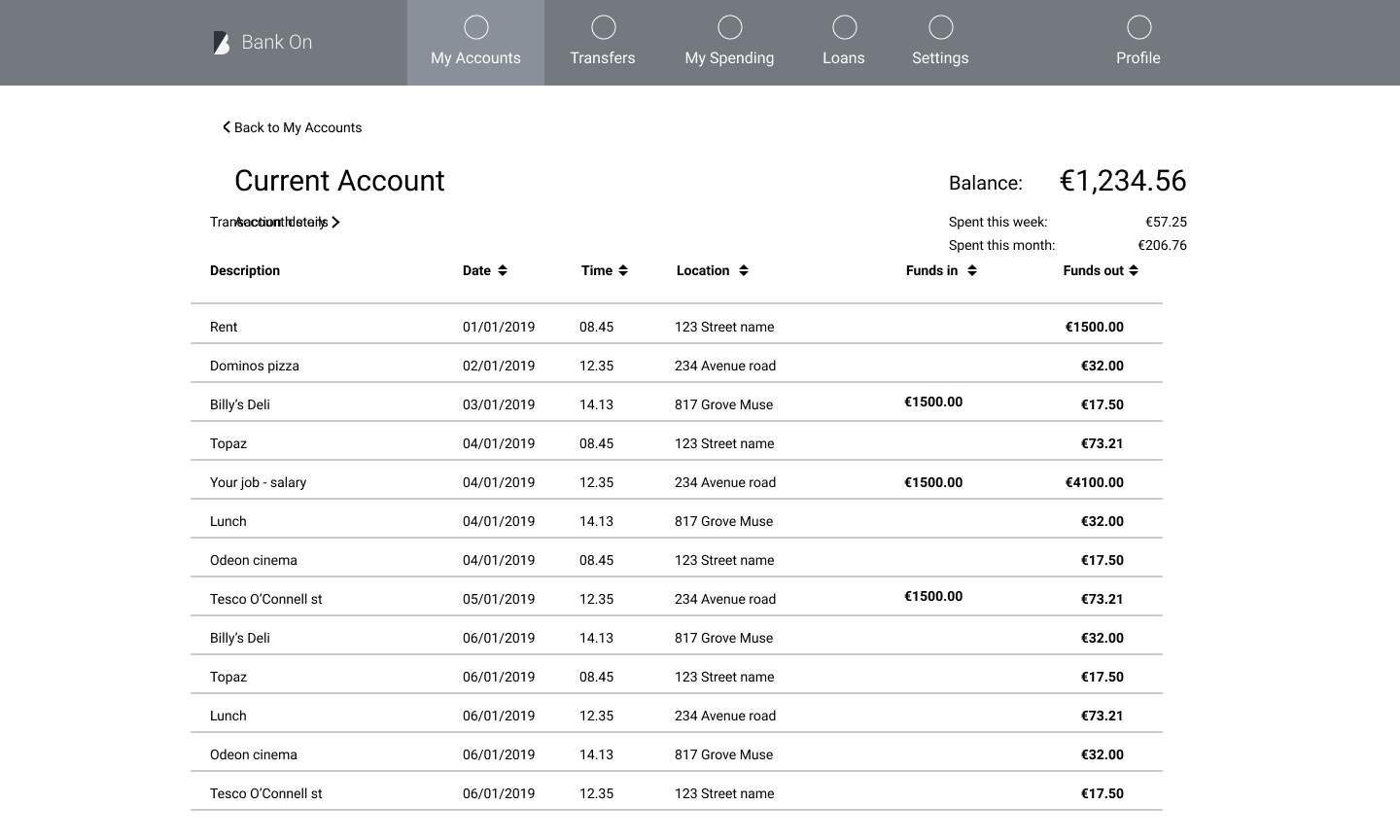
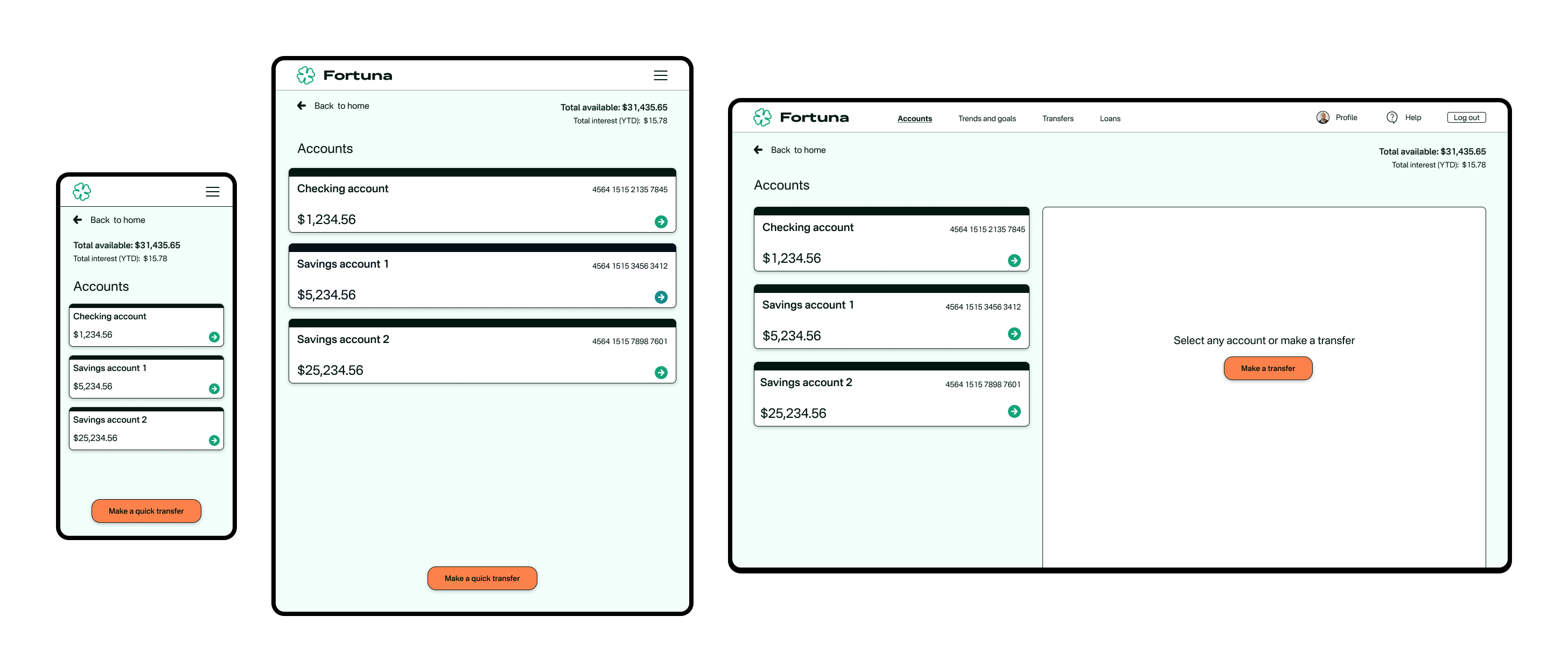
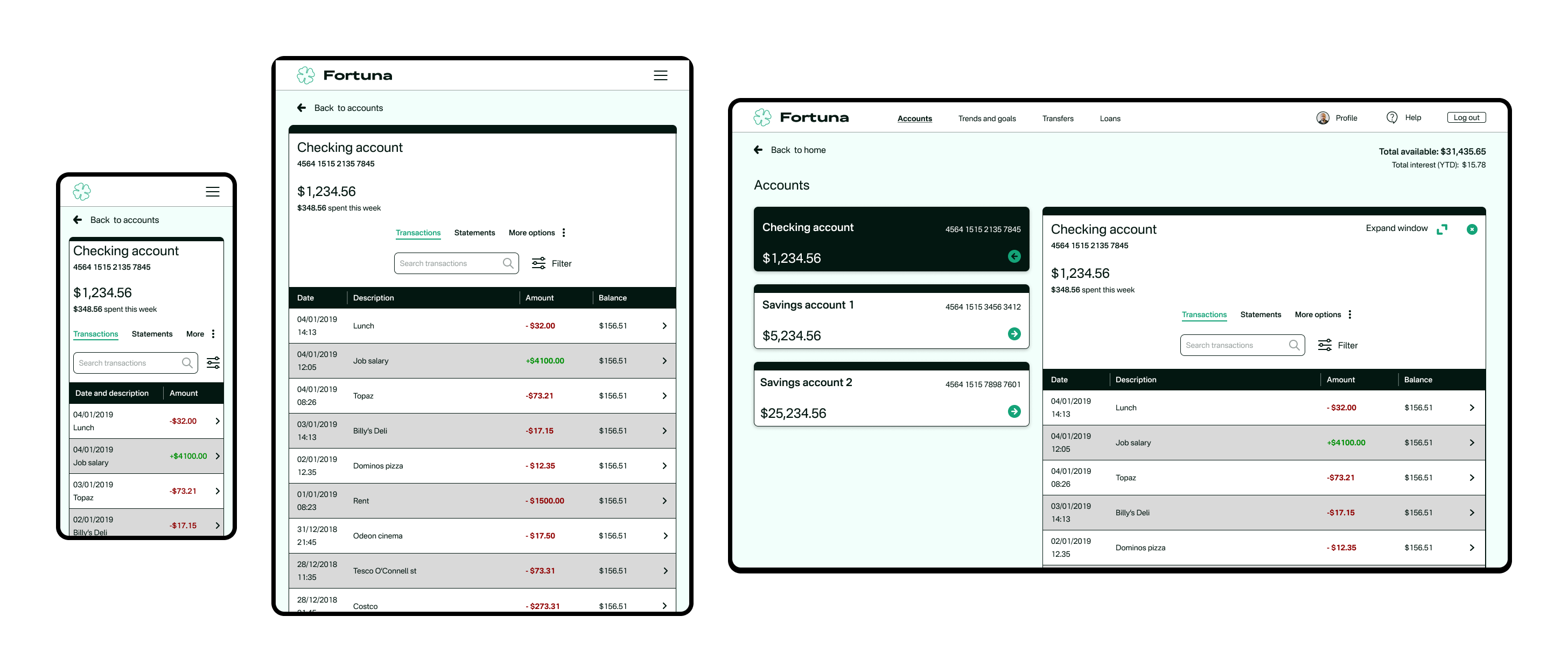
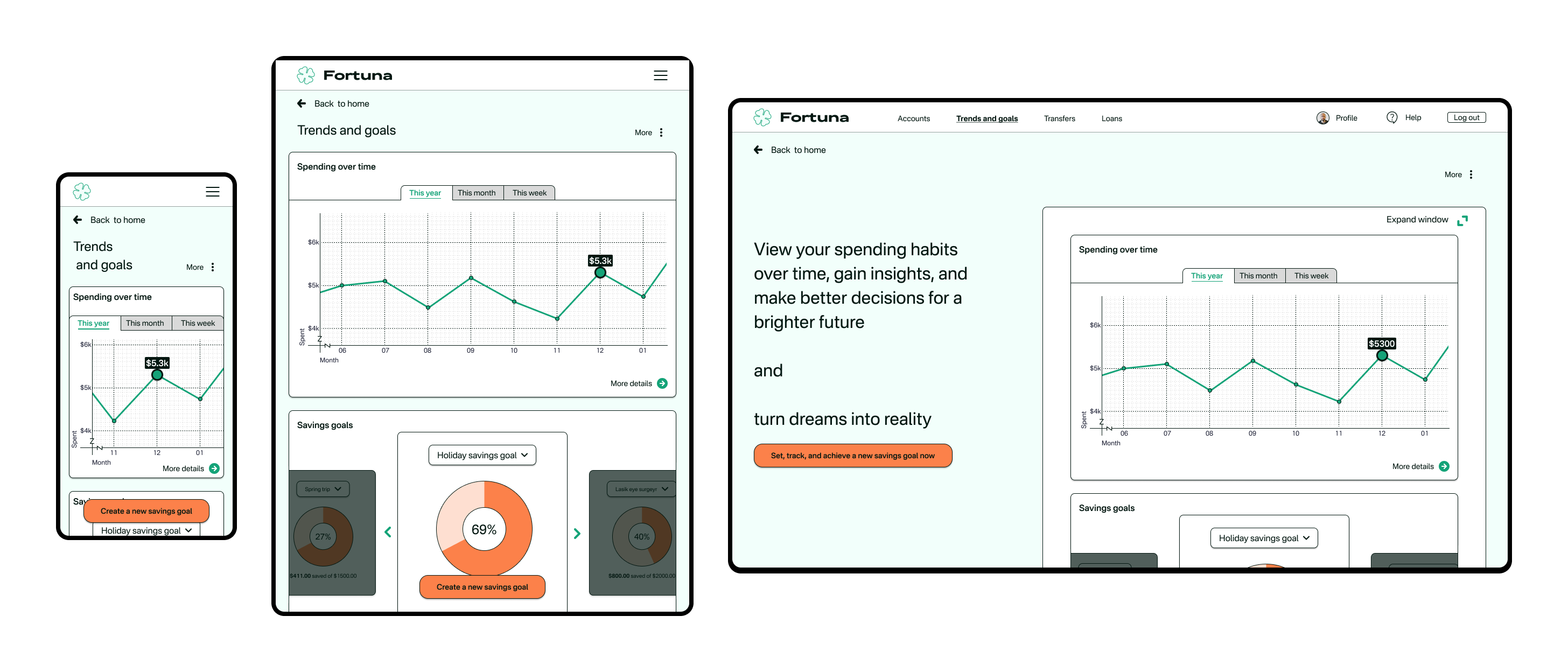
The UI is designed to be intuitive with consistent flows for use across desktop, tablet, and mobile devices. The layout is clean and uncluttered, with logical information architecture that helps users navigate the site and understand the financial products and services on offer. Green and red colors help users easily scan for incoming and outgoing transactions.
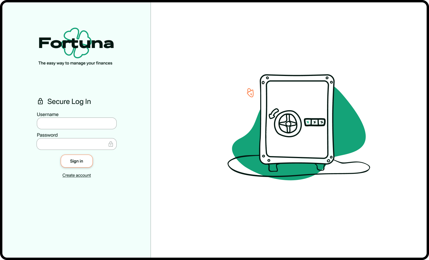
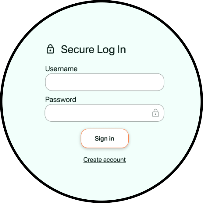
Trustworthy
To establish a reliable and secure environment, the brand incorporates several elements into its application and website. Clear communication about security measures, such as encryption, reassures users about the safety of their financial data. Help indicators are always nearby so that users do not feel they are left alone and they know where to go for assistance.


Conclusion
Overall, this UI app and website for a challenger brand in the financial world strikes a balance between playfulness and clarity, creating an intuitive and trustworthy experience that helps the brand stand out from the crowd.