UX DESIGN CASE STUDY / BUILDING A RESPONSIVE WEBSITE AND AN APP FROM THE GROUND UP
Ohana Hotels
The client was a new hotel group looking to create an online booking experience that is simple, accessible, and based on a deep understanding of their target users. The task was to design a new website and mobile app for the client, focusing specifically on the hotel booking process: how users search for and book hotel rooms online.
Platform: mobile app and responsive web design for desktop, tablet, and mobile
Role: sole product designer
Overview
The problem:
Hotel booking is an industry that can really benefit from UX. Booking a hotel room should be a simple process, but, as research has shown, sometimes it can feel too complex.
End goals:
- design and build a hotel booking app and website
- test with real users along the way
- end up with clickable, high-fidelity prototypes and annotated wireframes ready for developer handoff
From foundational research and initial sketches to a high-fidelity prototype. This case study is divided into the four stages that provide the groundwork of the design process:
research -> design -> prototype -> validate, and repeat as needed.
Feel free to jump to different sections using the quick links below.
1 Research
1.1 Understanding the problem
1.1.1 Competitive benchmarking
1.1.2 Online survey
1.1.3 Usability testing
1.2 Defining the problem
1.2.1 Affinity diagram
1.2.2 User journey map
1.3 Research findings
2 Design
2.1 Ideating solutions
2.1.1 User flow diagram
2.1.2 Site map
2.1.3 Wireframes and interactions
3.1 Designing solutions
3.1.1 Medium-fidelity prototype
4 Validate
4.1 Validating solutions
4.2 Usability testing
5.1 High-fidelity prototyping
5.2 Responsive website high-fidelity prototype
5.3 Breakpoints for different screen sizes
5.4 Mobile app high-fidelity prototype
5.5 Accessibility standards5.6 Annotations for developers
6 Conclusions
Stage:
Research

Understanding the problem
To better understand the hotel booking process for users, three research methods were conducted:
- competitive benchmarking
- online survey
- usability tests
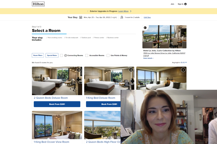
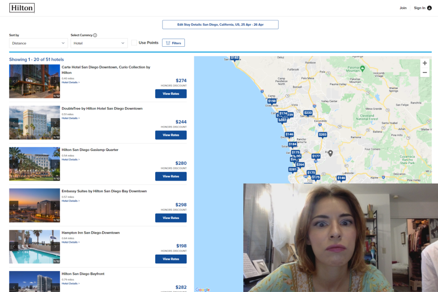
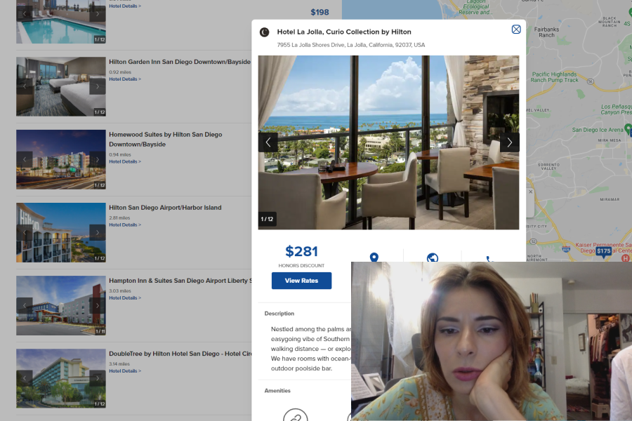
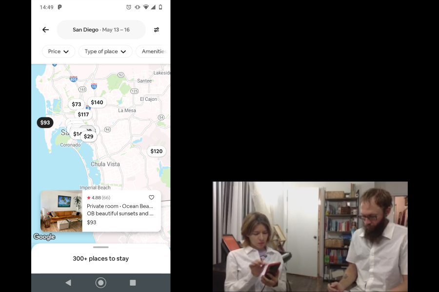
Competitive benchmarking
The first step was to survey the hotel booking landscape, analyze how best-in-class products are solving or not solving booking process problem, understand current conventions to follow, and identify the strengths and weaknesses of the current products.
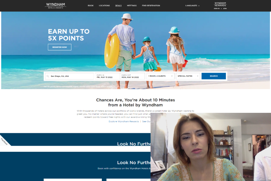
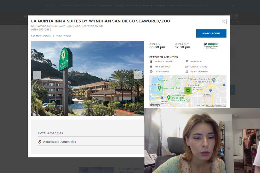
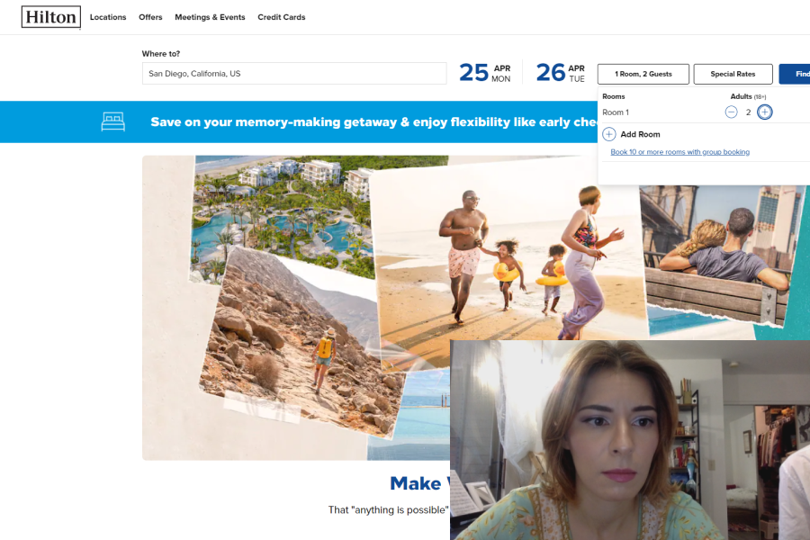
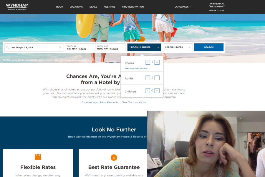
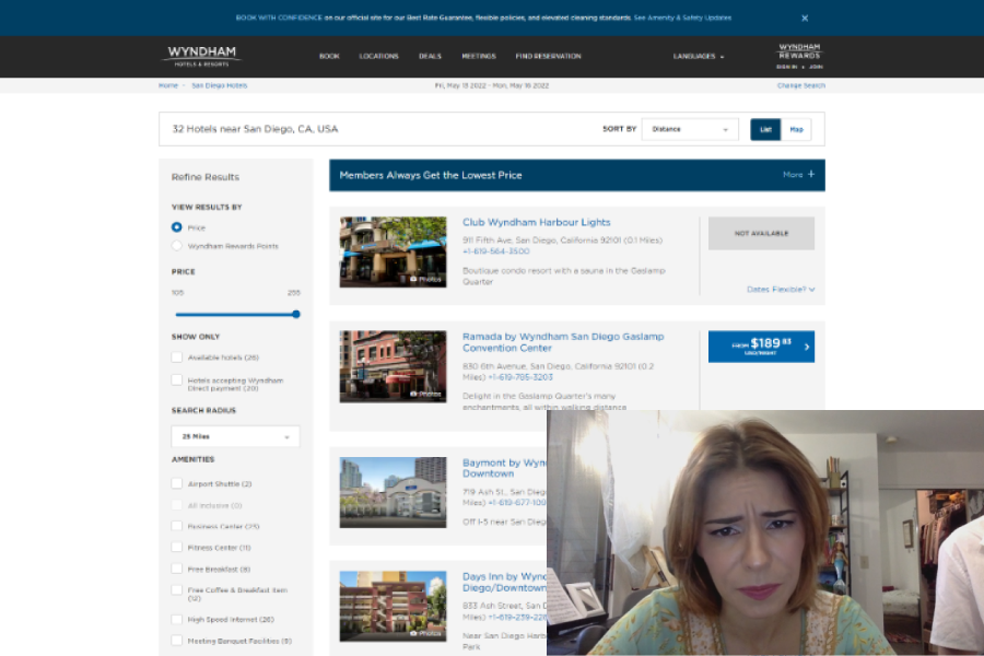
Four competitors, three direct and one indirect, were selected for comparison: Marriott, Hilton, Wyndham, and Airbnb.
The areas of focus were the homepage, search and select pages, and the booking process up to checkout.
Takeways
Benchmarking provided good examples of how major brands are solving the searching and booking process for their users. Many current conventions could be observed, particularly in calendar and hotel page designs and in general user flow.
Possible areas of exploration and improvement:
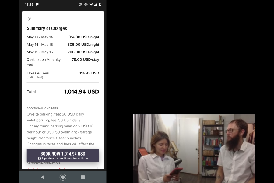
- increasing the transparency of pricing details
- designing clearer methods of presenting pricing information as well as details about available options
- ensuring map functionality and access
- streamlining certain processes, like when returning to the app or website after time has passed
Online survey
The online survey was designed to learn more about the goals, behaviors, and context of users when booking hotels. Data gathered from the survey could assist in making more informed design decisions.
What are users trying to do?
Is anything preventing them from doing it?
What other features would they like to see?
Please see the slide deck for a presentation of the survey materials and results.
Takeways
All the users that responded to the survey were able to complete their task; however, most reported encountering some difficulties or pain points along the way. Most users felt they had to utilize multiple tools in order to best accomplish their goals (comparing prices or finding more information).
Possible areas of exploration and improvement:
- comparing prices and options was reported to be of great importance to users.
- users wanted easier navigation, simpler designs, and clearer / more information about hotels.
- most users utilized multiple tools during their process as they felt no single product could give htem all the information they needed.
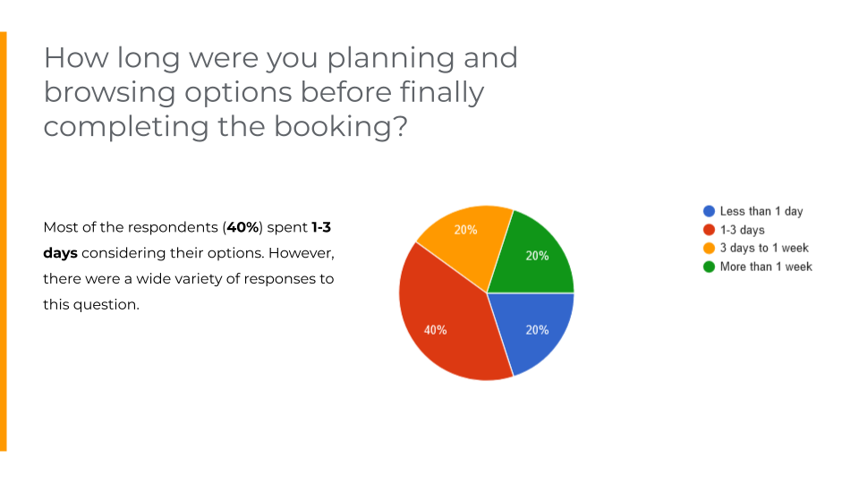
Additionally, most users considered their options for several days and sometimes more than a week before making a final decision.
Usability testing
Usability testing is the most powerful tool a UX research has. Rich insights can be gained directly from users, and these insights inform design decisions, which makes better products.
Usability tests were set up along with depth interviews as part of the session. These tests and interviews allow learning about users' goals, behaviors, and context when booking on a website or app.
Six products were used in the tests and interviews: Marriott, Hilton, Wyndham, Airbnb, Barcelo, and The Doyle Collection.


Takeaways
Detailed notes were taken to highlight key insights from each session for easy referencing.These notes are valuable data regarding users' goals, behaviors, and context while booking hotels, as well as any positive interactions and pain points.
Some of the key findings were as follows:
- Users wanted the product to remember their previous searches for if they had to start over or return to the app
- Users were often confused regarding the locations of the hotels, they want to see locations on a map
- Sometimes the method of selecting dates on the calendar did not match their mental model
- Unexpected prices were unpleasant to encounter
- Users wanted it to be easier to find the information they were looking for about hotel details
- There was some frustrating regarding completing a booking and confusion as to whether they could check out as a guest
As far as positive insights that were encountered, users appreciated when there were ratings and reviews of the hotels, especially TripAdvisor ratings, and users enjoyed viewing nice imagery.
Defining the problem
With the collected research data, it was time to analyze the findings.
An affinity diagram and a customer journey map can be used to synthesize the research results which can then be turned into meaningul, actionable insights.

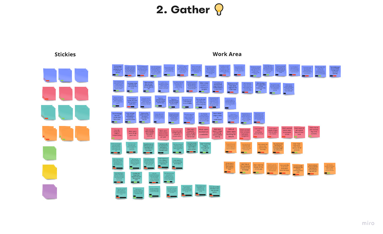

Affinity diagram
Affinity diagrams are a great way to sort through large volumes of data for further analysis and making design decisions.
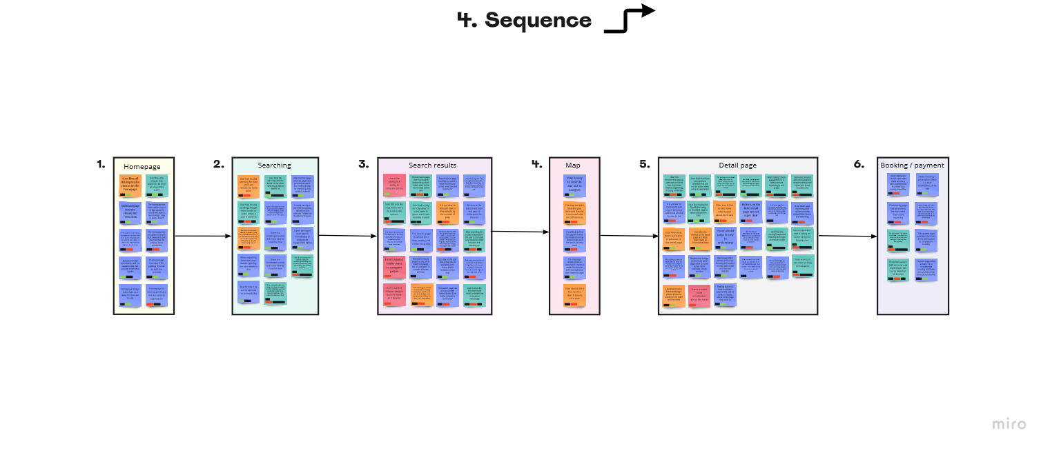
All the research data was broken down into individual units and each piece was written on a digital post-it note in Miro. Post-its were then organized into related groups from the patterns that emerged after reviewing the Notes. Next, the groups were labeled. Finally, groups were arranged in chronological order.
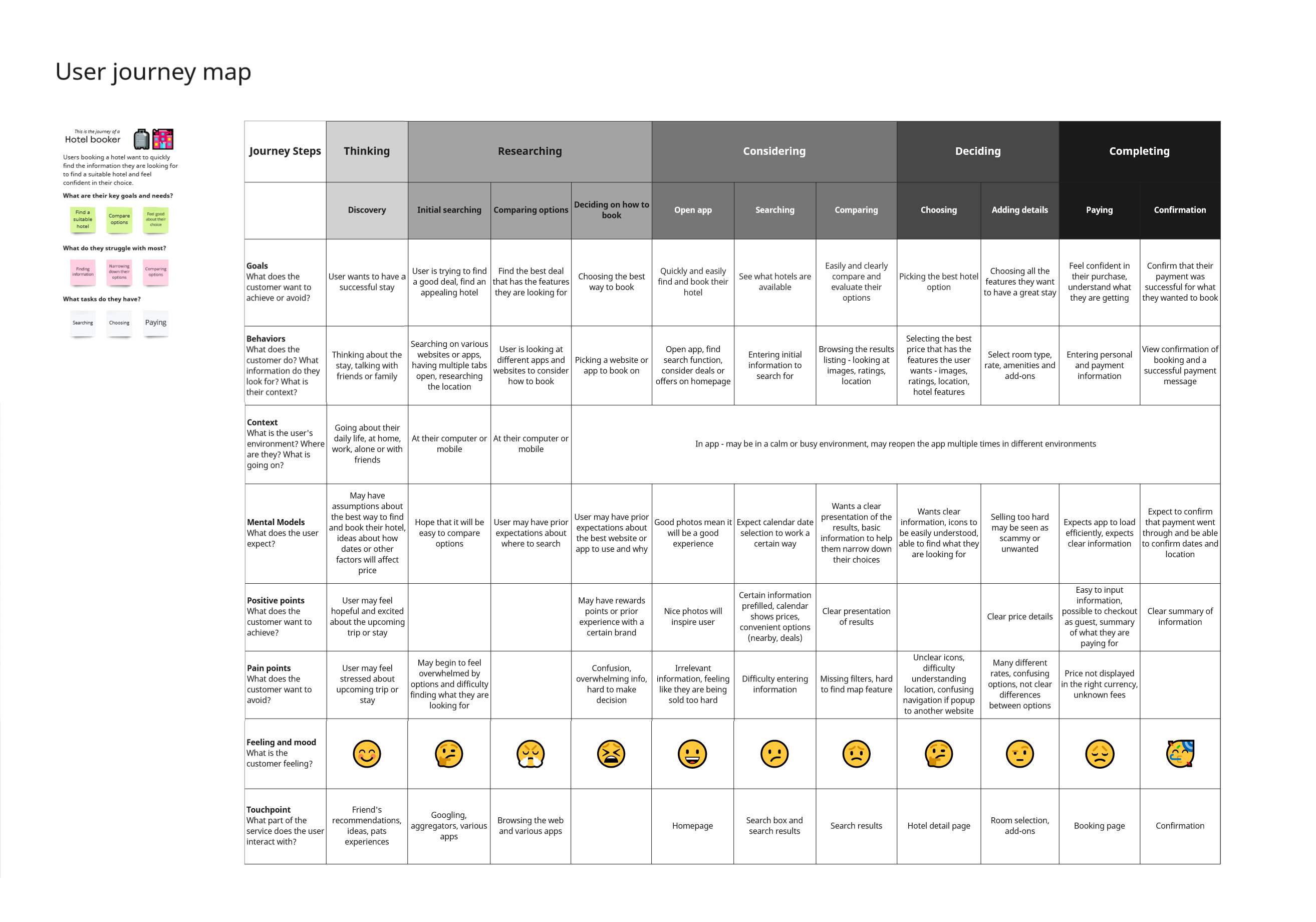
User journey map
The chronological order helps set the stage for a user journey maps, which provides more structure and details the user experience through the sequential steps of planning and booking a hotel.
It was found that users undergo a journey that could be grouped at a high level into thinking, researching, considering, deciding, and completing stages.
Each step of each stage was then elaborated on in terms of users' goals, behaviors, context, mental models, positive points, pain pionts, feelings and moods, and product touchpoints.
Research findings
As the user journey map shows, most hotel booking products start with a standard approach, but they take different approaches in design when it comes to displaying results, hotel information, and fees. Users are experiencing frustration and the most difficulty when having to choose between and compare options.
- Users need to be able to easily compare options and pick up from where they left off since research shows most users spend multiple days considering their options before making a choice.
- Users are discouraged when details are not being clearly displayed, including information they want to know about the hotels as well as transparent pricing information that does not change unexpectadly.
- Booking a hotel is a process where users must consider and assimilate a lot of information to feel good about their choice. Design solutions should allow for easy and logical navigation that minimizes cognitive load. By doing so, users can easily access the information they want and proceed in the smoothest manner possible.
Stage:
Design

Ideating solutions
With a full understanding of the problem space, it was time to ideate and design possible solutions.
Here, a user flow diagram, a site map, and interaction design wireframes were created with the objective to fix the issues that were uncovered during the research phase.
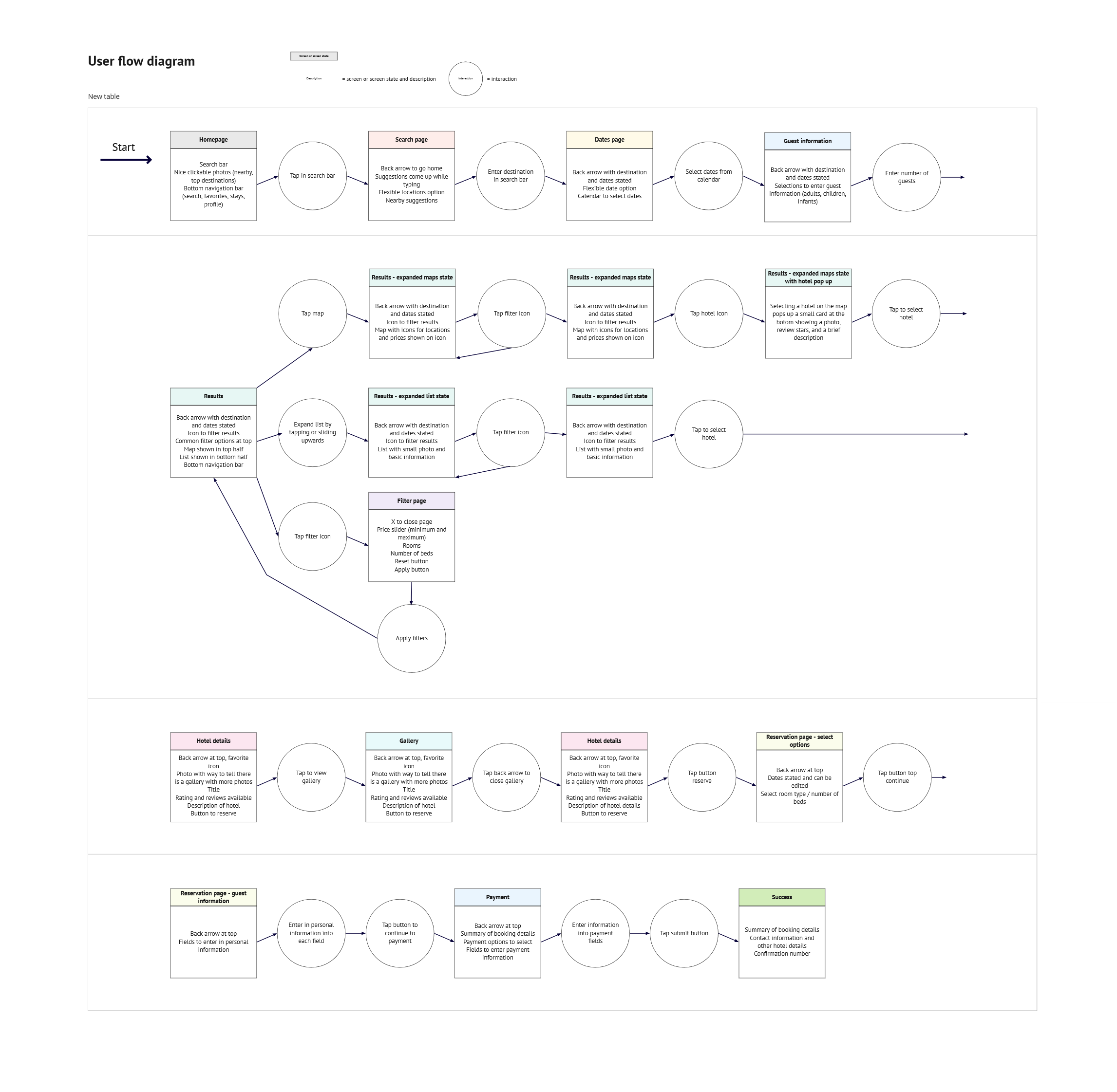
User flow diagram
A user flow diagram, maps out users' flow through the primary process, providing a structure for the product.
Findings from all the research before this point informed on how users are likely to move through the booking process in the current product space.
At the same time, changes were made for the design of the new product. The focus was on creating a smooth user flow that would make the process easy and efficient for users.
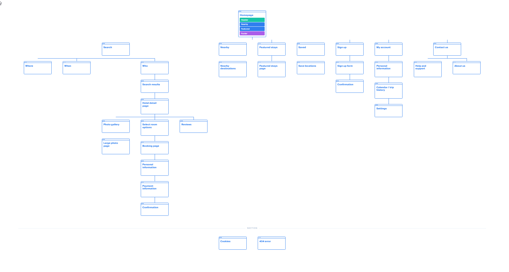
Site map
For the site, it made sense to stick many of the conventions that were found during competitive benchmarking. This way users would not be thrown off by anything unexpected.
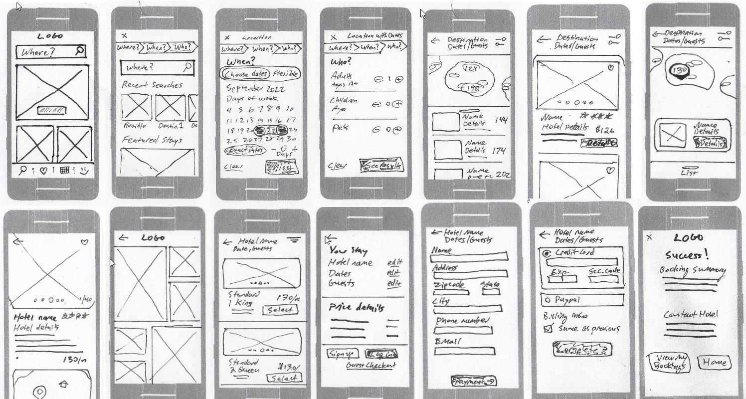
Wireframes with interactions
Mobile-first design was utilized to deliberately focus ont he most essential features and prioritize the core functionality.
Here, the problems and goals uncovered during the research phase were addressed while keeping in mind the common conventions that were already working well for users.
This was also the time to plan the navigation style and use sketching as a tool for further problem solving.
For example:
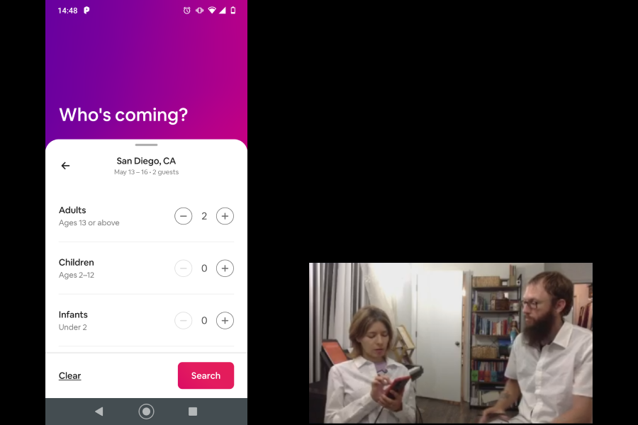
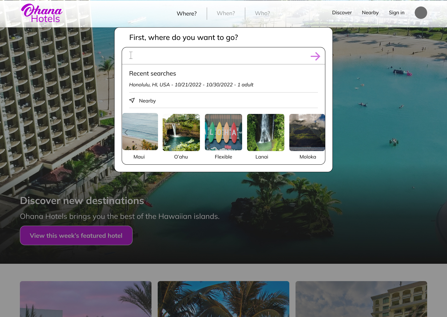
- The search process was turned into a modal with three tabs for the three main criteria. This allows users to easily edit their search while also showing their current progress.
- Price was a major consideration for most users so the dates page allows users to search flexible dates or + or - a certain number of days to find the best rate.
- Competitive benchmarking showed that some apps and websites did not default to at least 1 guest which created an extra step for users since every booking would have at least one guest.
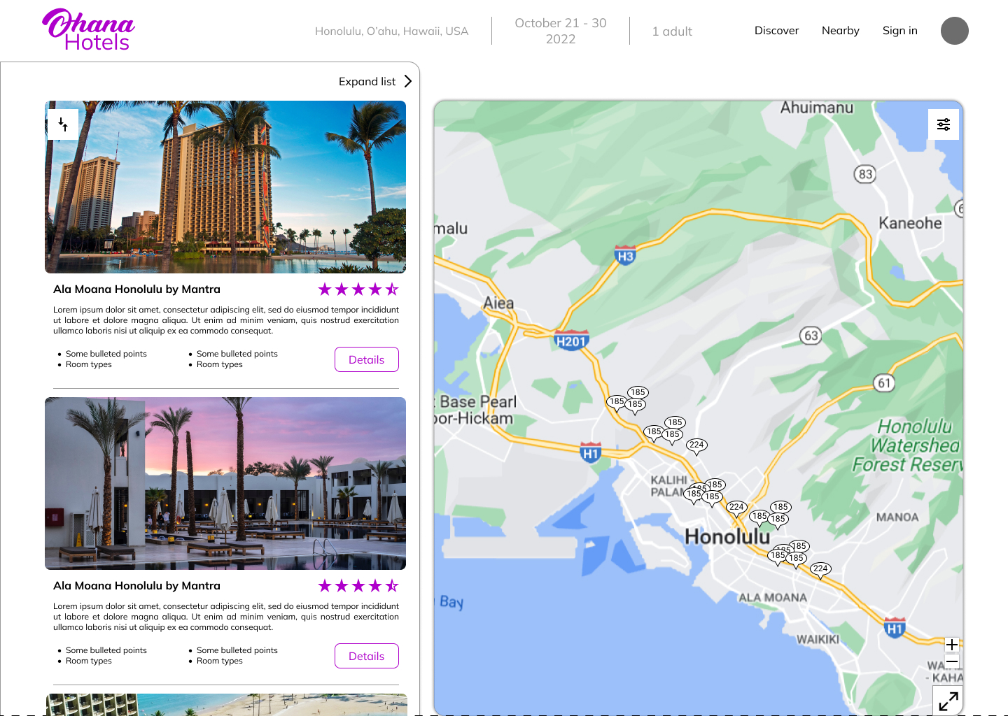
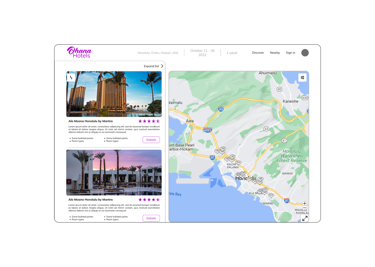
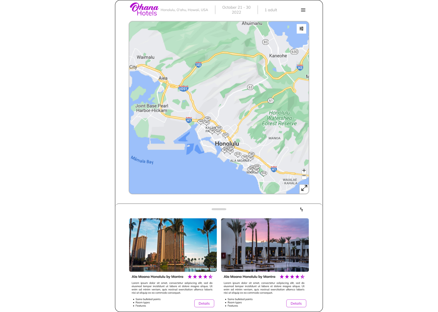
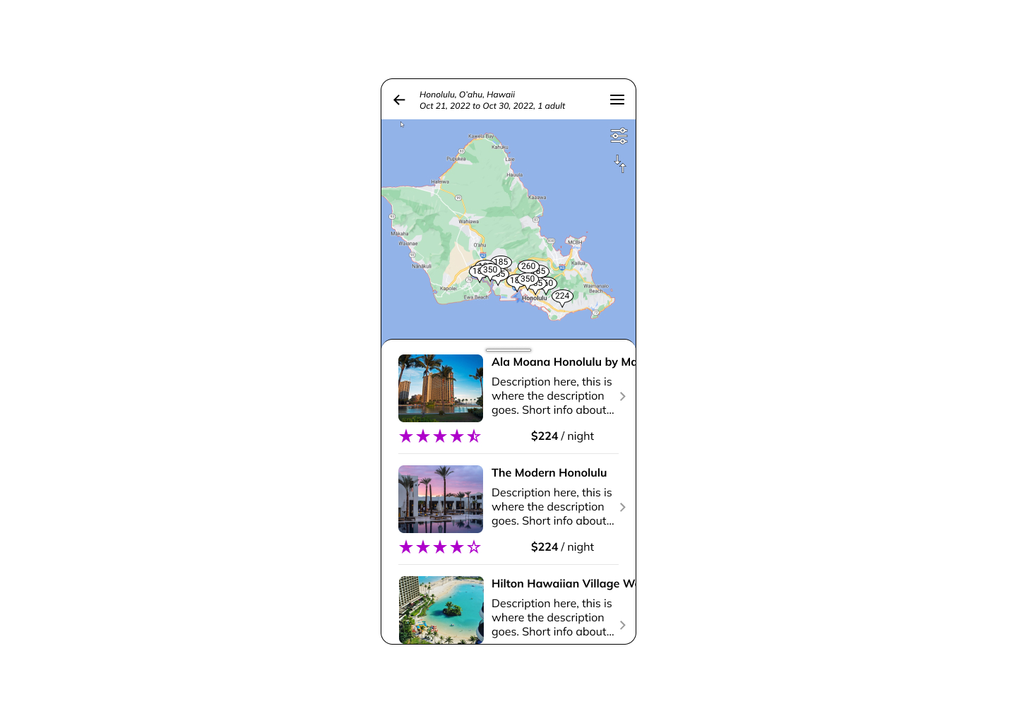
- Usability tests showed that most users wanted to see their hotel on a map and that many of them had trouble finding the map page, if it existed at all. The results page was designed to be split in half to immediately show both list and mapped results.
- While in the expanded list view, there is still a prominent map button that stands out and should be easy for users to find.
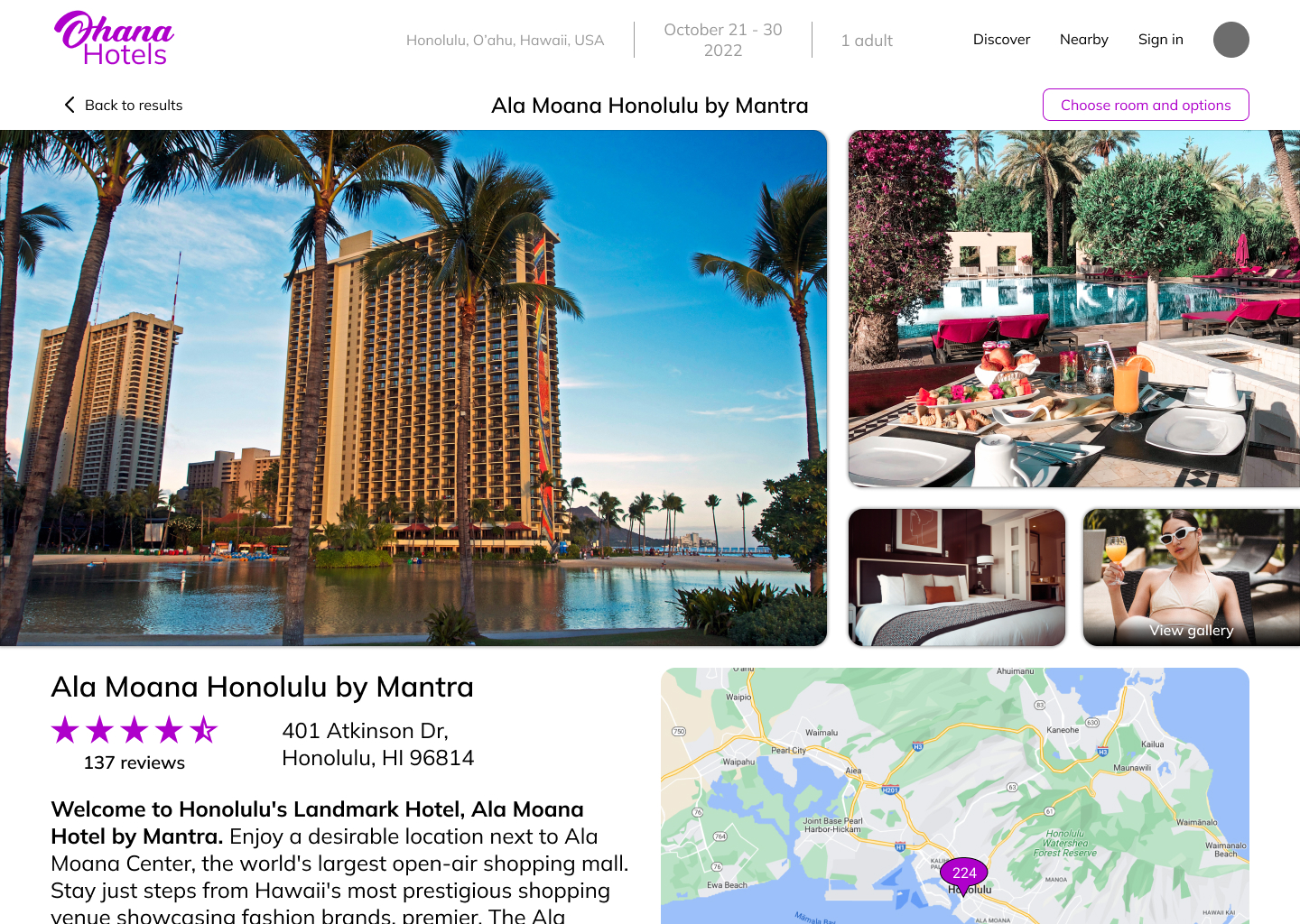
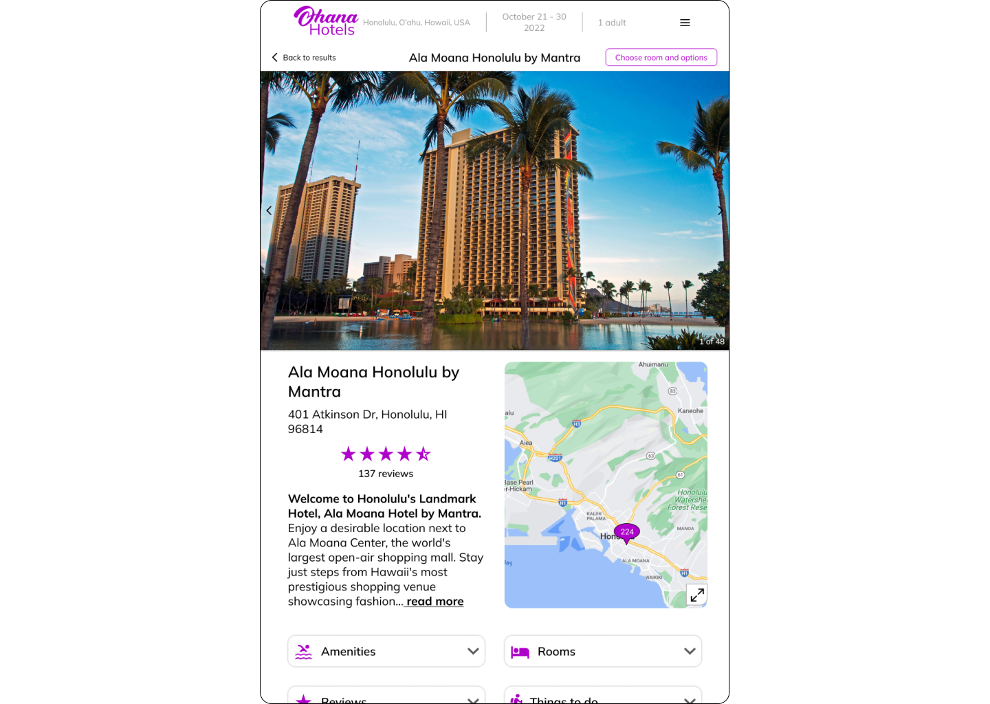
- The hotel detail pages contain a smaller, expandable map to remind users of its location and allow for easy location consideration.
- Hotel information is organized, clearly labeled and with icons, and expandable for when more details are desired.
Stage:
Prototype
Designing solutions
The next step was fine-tuning the design details and creating a more lifelike model of how the product will look and function.
Medium-fidelity prototype
A medium-fidelity prototype was created to evaluate the high-level flow, screen layouts, text, and basic interactions for validation before making a high-fidelity version.
Stage:
Validate
Validating solutions
Design is an iterative process, so a usability test after making a medium fidelity prototype is a good opportunity to validate design choices and learn what is working and not working before investing additional energy into a high-fidelity prototype. In addition to solving the user problem, the product should be a pleasure to interact with.
Usability testing
This round of testing investigated the Ohana Hotels medium fidelity prototype to evaluate how well the design choices were improving user experience while booking a hotel.
Other insights:
- Users liked the fact that the app remembered not only their prior search location, but also guest and date information.
- Users prefer seeing the average price per night as long as it includes all the fees.
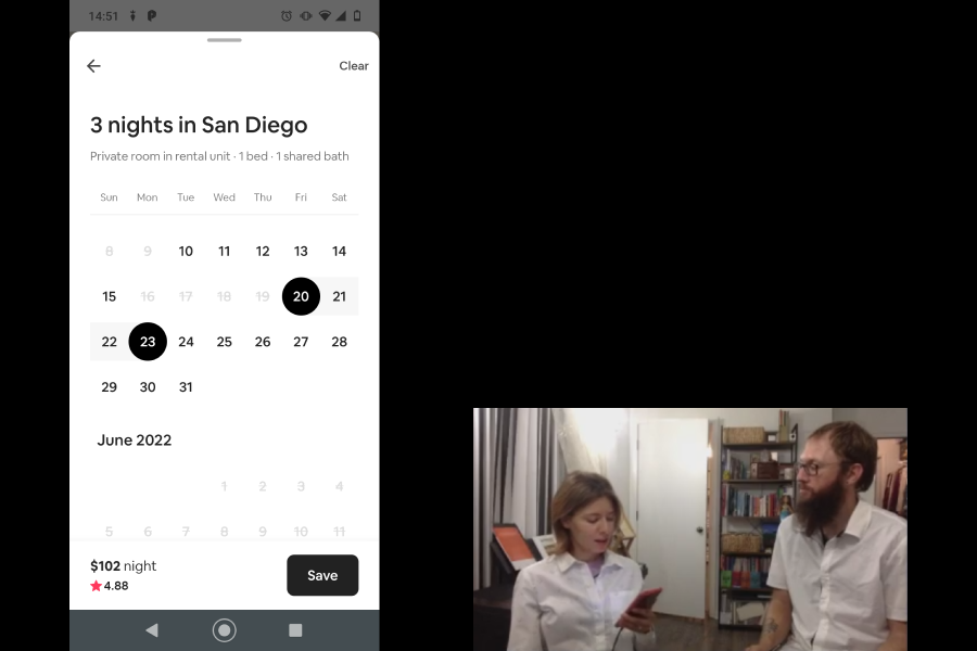
- Calendar operations were narrowed down for selecting dates. The first click/tap on a calendar should select the first day, and the second click/tap should be the last day, both of which should be darker than the days in between. The calendar should be easily and quickly scrollable and it should be possible to manually enter dates.
- Although the main search criteria (where, when, who) were divided across three pages, whereas other apps often put them all on the same page, users felt the mental load required was less.
Stage:
Prototype

High-fidelity prototyping
With the results from the latest round of usability testing, a high-fidelity prototype could be produced to better represent how the actual products will look, feel, and be interacted with.
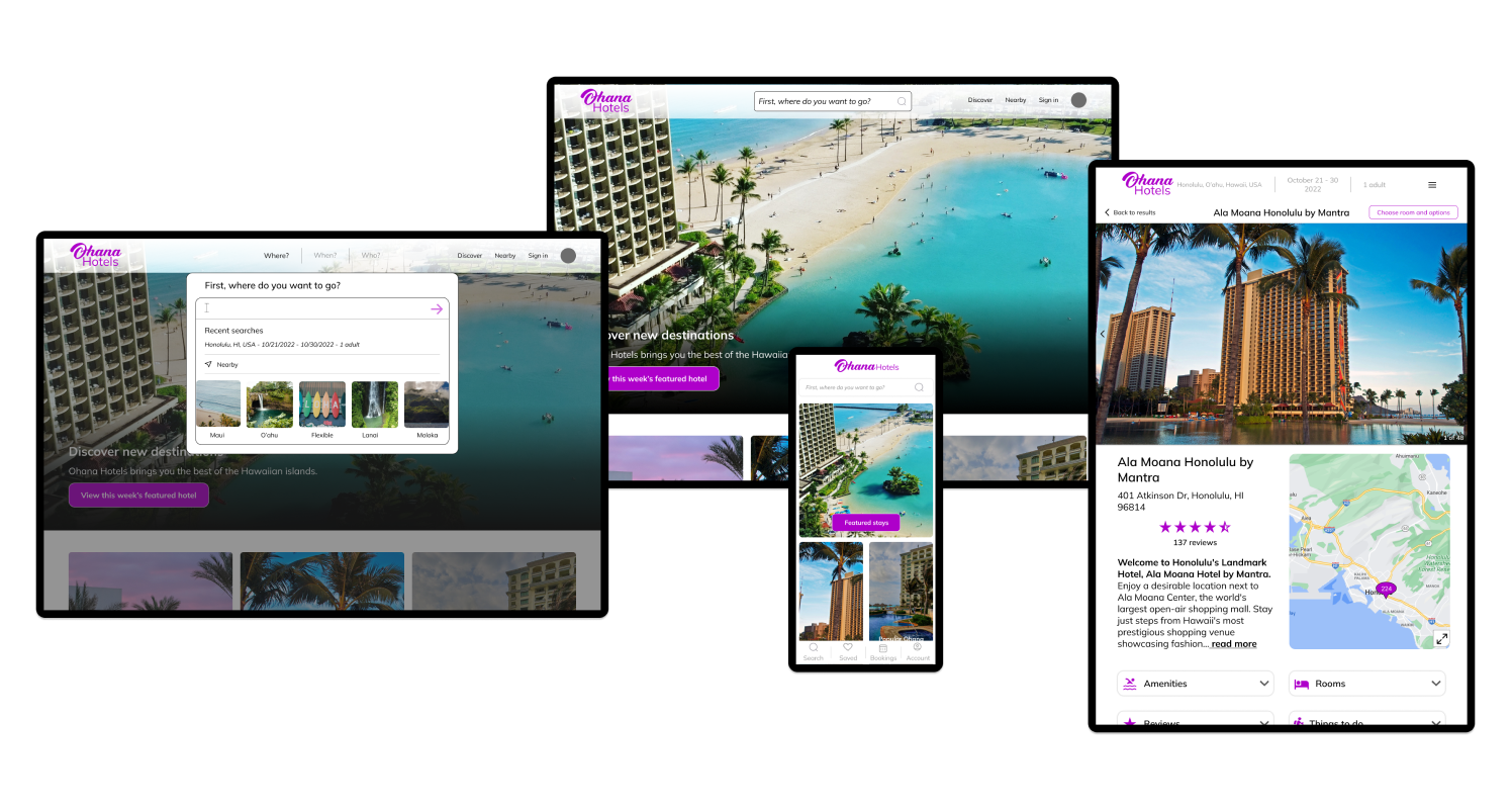
Responsive website high-fidelity prototype
A high-fidelity prototype was created to show how the actual product would look, feel, and be interacted with by users. A responsive web design was created with breakpoints for use on a desktop, tablet, or mobile phone.
Since most users spend multiple days researching and considering their options, it is important that users can access the product from multiple devices, no matter where they are at the time, and easily continue their search from where they left it.
Breakpoints for different screen sizes
Below are the responsive screen designs at different break points.
Research showed most users spend multiple days considering and searching for their hotels. That's why it is so important that the website works on any device. Users may be researching their options while they are at home, at work, or on the go.


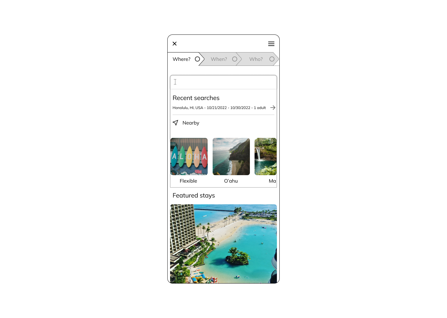
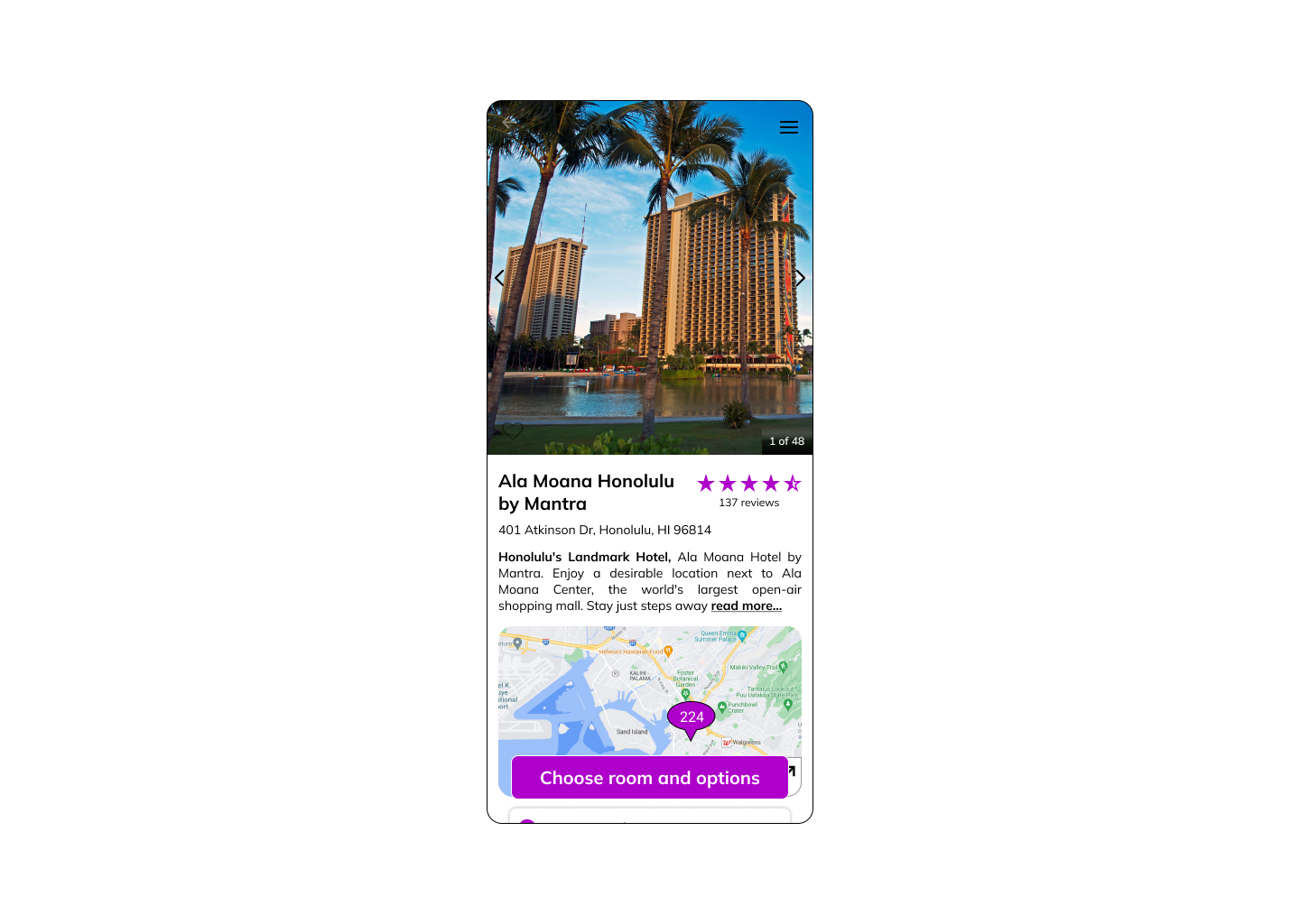
Mobile app high-fidelity prototype
A high-fidelity mobile app prototype was created for if Ohana Hotels released a native app.
Mobile app solutions
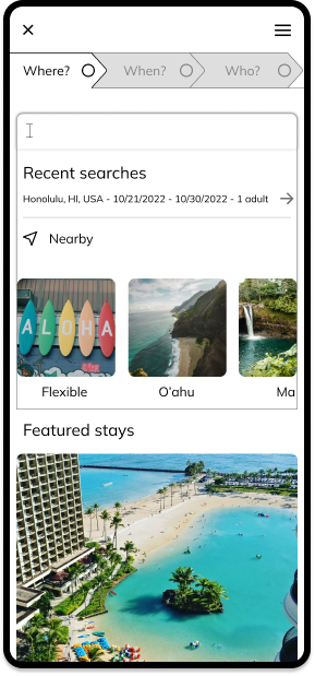
Since research showed most users spend multiple days before finalizing their booking, it is imperative that users are able to quickly resume their search from where they left off. Being able to continue with dates and guest information remembered further smooths the flow.
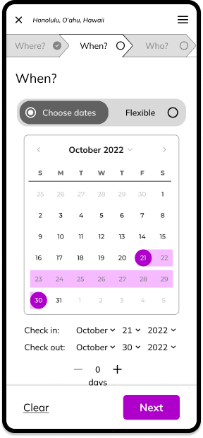
The searching modal serves as a progress indicator and a convenient in-search navigation bar so users can quickly edit their criteria as well as view their progress.
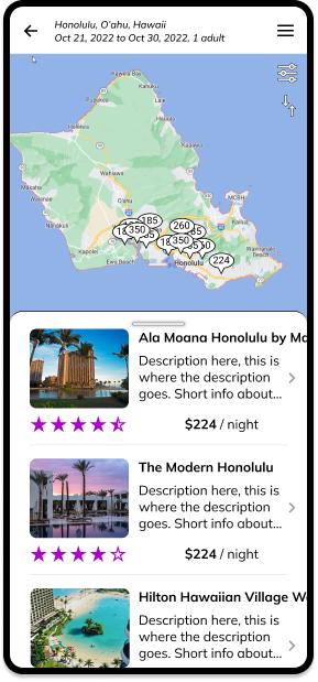
Most users wanted to easily be able to see the locations on a map and many users had trouble finding the map on the results page. Defaulting to screens with a split list / map view makes it easy for to know both are available.
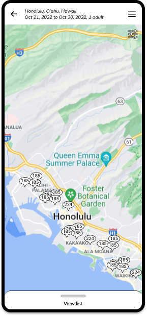
Whether users are on the expanded map display or the expanded list display, it is always clear that the other option is available. A list slider remains at the bottom of the map on the expanded list, and the expanded list has a floating map button in a bold color.
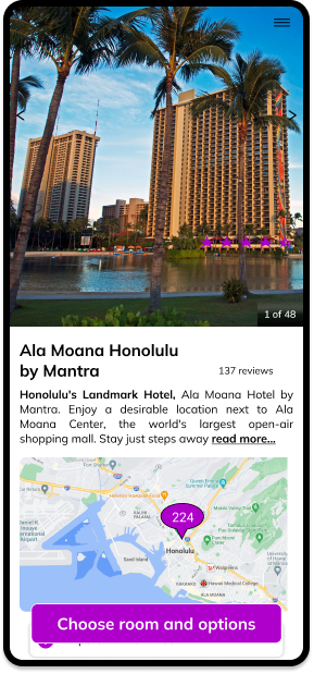
Each hotel detail page also includes an expandable map dispalying the hotel's location. This way users don't have to return to the result page to remind themselves of where it is, as many are not familiar with the address and streets of the place they will be staying.
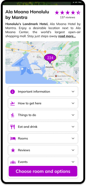
On the hotel detail page, relevant information is neatly contained and categorized with helpful icons. Many users felt overwhelmed by the amount of information, had trouble finding information they were looking for, and wanted icons to easily scan for what they are looking for.
Accessibilty
Before shipping any product, it is important to check the accessibility. All essential items for the user to the complete the task (this means all text and buttons) should pass the relevant checks.
Below are the passing WebAIM.org scores for the buttons.

Deliverables
Annotations for development
One of the last steps was to prepare a static wireframe document detailing the function and form of the elements and interactions in the designs.
These annotations will provide developers and/or UI designers with much of the extra details they would require to efficiently develop the app.
Conclusions
Users are less likely to feel the need to switch apps/websites if the one they are using is easy to use and they can find all the information they are looking for.
By simplyfing the flow and cleanly categorizing relevant information, users are more likely to start and complete their booking all within the Ohana product space.
This case study shows the entire process of building a native app and responsive website from the ground up.
This project shows the importance of research to UX.
Fundamentally UX is a problem-solving discipline. It is about researching users' problems and designing solutions to solve those problems.
Following UX best practices minimizes the risk of building unnecessary products and the risk of an unsuccessful product.
Usability tests show that you can gain rich insights into users' goals, behaviors, and context.
Finally, users want to products to help them reach their goal, whatever that may be - great design can help the product do so.