A DETAILED LOOK AT HIERARCHY IN
product cards
What is the step-by-step design process when creating product cards with a focus on hierarchy?

1
what is the goal?
In this case, users are either seeking more information or proceeding to ordering by clicking one of the buttons.
In the beginning, it is best to use the same font everywhere (as shown in the before slide above) so that you can focus on the groups without getting distracted. At this time, you can think about what logical groupings exist, which will help understand how the user will process the information.
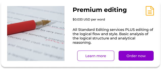
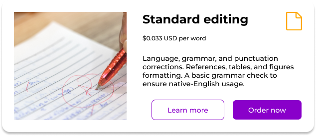
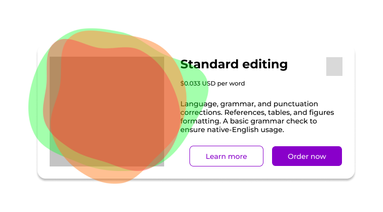
Here, natural groupings are the image, the title, the description, and the possible actions.
There is a connection between elements that should lead to one of the actions.

- The image will be the first to attract the user's attention and have an emotional effect on them.
- Then, users will most likely read the title which contains the most essential information.
- Next, the description provides additional information of secondary importance to users that want it.
- Finally, there are the actions for the user to engage with and reach their goal.
The typography can then be considered with these things in mind.
2
typography
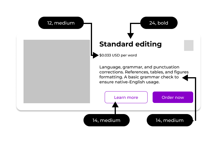
The typography can be considered once the basic hierarchy and connections have been determined. Often times, just one font is enough and sufficient options can be created simply by changing the size and/or style.
In this example, one font (Montserrat) can be used in three different sizes and two different styles.
This is enough to differentiate between the goupings and allow the typography to assist in creating a smooth flow through the user experience. Spacing can then be adjusted to further facilitate user movement.
3
spacing
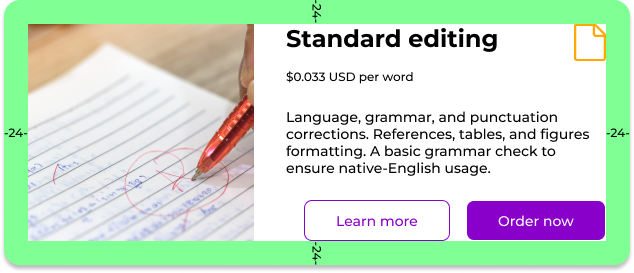
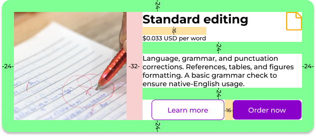
Twenty-four is a good internal padding for the card.
Among the four main groups of items (image, title, description, action buttons), the most likely order in which they will attract users' attention is as follows:
- The image will be the first point of interest and have an emotional effect on the user.
- Users will then read the title for the most essential information.
- Many users will skip reading the description fully or at all unless they feel they need more information before making a decision.
- Finally, users will take an action with one of the buttons.
At first glance, an eye-tracking study would likely show most users attention hitting somewhere in the highlighted area below.
Since the image stands out from the other items so much, as a first step, it can be considered on its own and the other groups can be combined into another group. By understanding that most users will look first to the image, the design can facilitate this and have the image clearly and distinctly separated in the hierarchy from the other items. This way users will not feel crowded or overhwlemed by the text being too close to the image.
Thus, because of how differently users will interact with the image compared to the other items, 32 is a good distance to place between the image and the other items to the right.
This will be the largest distance in entire the card.
To the right of the image, all of the three subgroups (title, description, and buttons) can be separated by 24. The clean division here allows easy parsing whether people want to read the description or skip over it.
Between the buttons, 16 can be used since the two buttons can be perceived as belonging to the same group because they are both an action for the user to engage with.
4
outside the box
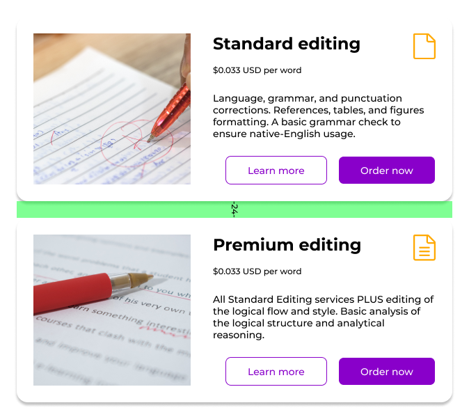
It is also important to consider outside spacing, especially since product cards are often used as a series with multiple cards appearing next to each other.
For division between cards, an amount the same as the internal padding is good. Using a larger mount would make it more difficult for users to quickly jump from one card to the next.
Each card having a border with a drop shadow also helps them stand out from each other so more spacing is not really necessary.
5
accessibility
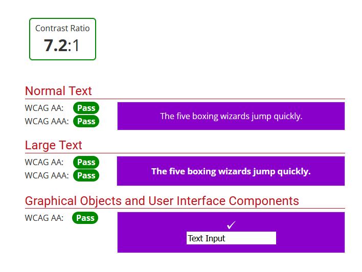
Finally, while designing anything, it is vital to check the accessibility of everything as you go. All essential items for the user to the complete the task (this means all text and buttons) should pass the relevant accessibility checks.
To the right are passing WebAIM.org scores for the buttons.
6
conclusions
Creating a successful design with hierarchy is more than just picking pixel spacing, even if they are chosen carefully and used consistently.
An effective order can be established by breaking down the design and thinking logically about how real users will be approaching and interacting with the product cards.
- What is the goal?
- Simple typography choices
- Logical and consistent spacing based on groups
- Accessibility check
By thinking through these considerations, a successful grouping of product cards could be designed.